Annalisa:
I love Annalisa's blog! Her work is amazing and her blog is very neat. I love that all of her pieces are very colorful because all of her work seems cohesive. Her work also inspires me to put forth more effort into my work.
https://annalisavaldivia.blogspot.com
Daphne:
I love the background Daphne used in the background of the blog! Her business cards and logo were very unique and a piece to see as soon as I clicked on the blog.
https://fmx210daphne.blogspot.com
Richard:
I loved his blog because as soon as you click on the link there is an image that appears that was different from any of the other blogs I had seen. I also loved the way that his page was organized because they are side by side instead of up and down and separated.
https://fmx210richardgill.blogspot.com
FMX Journey - Road to Mastering Digital Media
Sunday, May 12, 2019
Monday, May 6, 2019
My Portfolio!
Behold! My 2019 portfolio *insert fireworks*
Throughout this semester, I often had the feeling that I was not going to be able to finish the class and recieve a high grade. Now that I have made it to the end I am happy that I pushed myseld to continue and produce quality work. This class helped me realize my strengths and weakness when it comes to dfferent programs and applications. My brother is a graphic designer and he is very familiar with most of the programs that we used in the class and I plan on working with him over the summer to in order to freshen up on my skills. However, I am SOOO glad that I never have to take FMX again (:
Business Cards
These are my brand new business cards! I love that I was able to add my personal touch by incorporating my logo into each of them. I wanted to make them fun and easy to read which I think I was able to achieve. These would represent my brand very well if I decided to use them for my brand.
Sunday, May 5, 2019
Cinemagraph
For my cinema graph, I decided to use a moving waterfall. I love the setting because it makes me feel a peace and on vacation. I used photoshop to create this piece and it took me awhile to get it exactly how I wanted it. I am happy with how the piece turned out in the end.
Wednesday, May 1, 2019
Wednesday, April 10, 2019
Meme - Hangry
Hangry
This project was inspired by my hatred for my my boyfriend's habit of eating without me! Sometimes when I hang out with him I ask him if he's hungry he tells me that he ate before I came (which is rude! lol) Although I'm never actually mad at him, we always laugh about it because he knows that one of my favorite activities is going out to eat and trying new foods.
I used photoshop to create my meme.
Somewhere - Work the Runway
Life of a Model
When I was younger I always wanted to be a model. I grew up watching America's Next Top Model and idolizing the , tall women that grazed my television. For this assignment I was instructed to photoshop myself in a place I've never been before. Considering that I'm 5ft 3in, being on a fashion runway would be a very hard goal to accomplish. So I decided to live my dream through photoshop! This project was a a lot of fun and it was fairly easy to create.
Original Picture:
Auto-copy (Brainwash)
Brainwashed Society
We are a brainwashed society. Media and advertisements flood us with subliminal messages daily without us even realizing it. My love for advertising inspired this piece. Considering that I am an advertising major, over the years I have learned about strategic advertisements and messages secretly placed in the media that are caught by viewers subconscious mind. The messages send hints for us to behave a certain way or purchase a certain product. Everything around us is an advertisement. We can't escape it. From specifically placed colors that are linked to hunger in food commercials to a quick flash of an image during a commercial. In my image the background is supposed to be chaotic representing the loads of information being thrown at us daily. Our bodies are filled with patterns which is supposed to represent the media's influence on us and its impact. We carry the media's suggestions with us everyday.
Original Picture:

B/W To Color
I absolutely loved this project! Once I got the hang of it and figured out how to customize each one this project turned into fun instead of an assignment. Each style that I was instructed to use came with a set of colors but those colors were able to be manipulated and transformed. This is a project that I am very proud of and it might even become a new hobby for me. Photoshop was the program that was used for this project and it was my first time using it.
Save The Planet!
Littering. Deforestation. Global Warming. Our planet is dying right before our eyes and humans play a huge role in its downfall. I created this piece because I strongly believe that you and I have the power to change Earth's future. Our oceans are filled with pollution because everyone thinks "it's just one piece of trash." These little things add up.
Ways we can help to save our planet:
Cut back on energy consumption.
Recycle. Recycle. Recycle.
Save water.
Carpool!
Shorten your shower time.
Thrift Shop! Second hand buying is a huge help.
Use less paper and switch to digital.
Small changes to your lifestyle can help the Earth survive. If we continue on the path that we are on we will continue to put our planet and it's animals in danger.
I created this project using Adobe Illustrator. This photo of me was taken in the Rocky Mountains during my trip to Colorado. I wanted to create a picture that had dark trees to represent decay while also outlining a few trees in green to represent hope.
Tuesday, April 9, 2019
Illustrator CC Tutorials
Before taking FMX 210 I was unfamiliar with Adobe Illustrator CC 2019. Getting familiar with the program can be frustrating at first but the program includes built-in tutorials that can be very useful. However, first-time users might need access to more instructional in order to feel more comfortable with the software. Youtube is a helpful tool that offers tutorials that cover any topic you can imagine. I found a few youtube videos that were able to break down the functions of Adobe Illustrator in depth so that I was able to navigate more easily.
The videos I found included:
Tuesday, March 19, 2019
Gradient Mesh
Bite Me
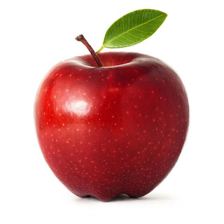
Gradient mesh is a tool used in illustrator that allows the user to create a replica of a common item by turning it into a virtual illustration. The use of different colors and shadows helps to give the item dimension and a 3D quality. For this piece, I decided to recreate an apple. The particular apple that I chose had many colors and highlights which was perfect for my first piece.
At first, this project was very difficult for me but after a while, I began to get the hang of it. Considering that this is my first time creating a piece like this, I am very proud of the work that I have produced. Perfecting the colors was a bit challenging but moving forward I will make sure that I create a color palette ahead of time to produce even higher quality work.
Apple I used for Inspiration:

Monday, March 4, 2019
If I were a symbol it would look like...
Eternal Happiness
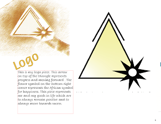
My main goal in life is to enjoy every second of it. I love change and trying new things. When I was asked to think of symbols that represented me I knew that I had to include something that dealt with the desire for constant change. The triangle I have included has a double meaning. The upper arrow on the triangle represents progress and moving forward. The delta placed inside represents openness to change. God willing, I will have a lifetime to explore all that life has to offer.
The symbol that is attached to the triangle is the African symbol of happiness. I pride myself on having an optimistic view of life. Seeing the bright side of things helps me to remain calm during stressful situations. Very few things upset me and I make it my goal to remain happy even during my darkest days.
I decided to make this piece fairly simple because if it were shrunken down, each aspect would be visible and the message would still be able to be explained.
Creative Process/ Sketches:
Subscribe to:
Comments (Atom)


